

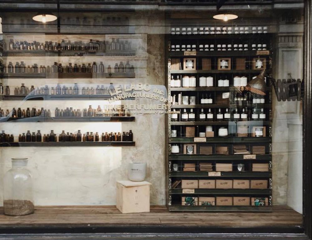
Less is more. Minimalist design, simple spaces, clearing the clutter, it’s all the rage at the moment. The concept of, ‘less is more’ can be heard when you choose simplicity over grandiosity. In shopfitting, people tend to spend a lot of cash and inject a lot of time, effort and energy in making a shop design as crazy and as engaging with the customer as possible. However, this might not always be the best solution.
Remember that when you are designing the interior of your shop, it doesn’t have to be as eye-catching or as loud as your exterior design. As much as possible, you want to lead the eyes of your customers towards your products. Feature them in your store design as much as possible. After all, when a customer enters your shop, you want them looking at your merchandise and actually purchasing something rather than them standing around, appreciating the carpet-look finishing you chose for walls and how easy it is to navigate between the raw recycled timber shelves. (We do that when we go shopping, well actually I look at what’s in the shop, John looks at how the shop was built!).
State of Minimalist Trends in Commercial Design
Fortunately, more and more high caliber brands are now embracing the minimalist approach to shop design. The principle of minimalism is geared towards highlighting things we value and removing possible distractions from that focus. With this, brands are slowly spending more on producing quality products than incurring additional cost on their presentation. They’re letting the product speak for itself without the distraction of too much advertising, promotion or creative presentations.
The same principle follows minimalism in shop design. You want design ideas that highlight your premium merchandise not distract people from it. Hence, instead of featuring walls with loud colors or bold patterns, (or that hideous carpet-for-walls I mentioned before), why not opt for light muted colored-walls and an accent wall where you hang all your high-quality products?
Instead of arranging shelves in a maze-like position throughout your shop, to guide foot traffic, why not opt for more open and spacious floorplans where customers are free to browse at their own pace and walk-around your shop freely? This not only allows customers more freedom in browsing for products, but also tricks the eye into thinking you have more space than you actually do.
So, the precept of less is more also applies to store design since you don’t want to overwhelm your customers with so much visual stimulation that they simply overlook your products.
In our next post we’ll look at the specific benefits of a minimalist shop design and some tips you can implement straight away to help you achieve the space you want.
In the mean time, if you want to chat with the team at Quickfit about creating this kind of space in your own shop, give us a call on 1300 95 94 93, we’d be happy to come to you.