
When it comes to shopfitting, it is very important to strategically coordinate colours of fixtures and walls to define the personality of your space. Colour is one of the most essential facets of designing as it has the most appeal in the visual landscape. With this, colour can be utilised as an optical illusion to make small spaces seem bigger. Choosing the right colour combinations can make or break the balance within a room as strong colours tend to pop and demand attention while lighter colours tend to highlight the backgrounds.
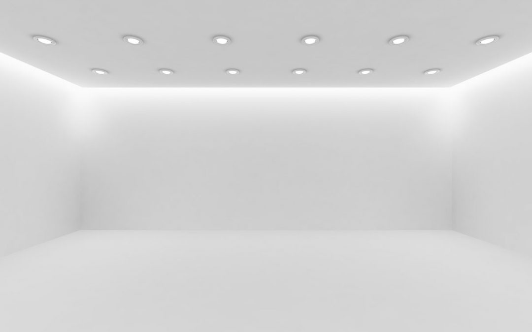
As such, there is a term commonly used in the construction and interior designing industry that many designers and shop owners dread to hear – that is the white box syndrome. A white box is a term used to describe a bland room with zero colour and no sense of identity. It features no focal point or depth that the eyes can settle upon making it look like an unappealing and bland boxed space.
Although such a room would be a designer’s worst nightmare, you can take advantage of this situation by simply using it as a canvas and painting over it with a few accentuating chromatic ideas. The following are a few tips on how to use colour to make your space more appealing, spacious and reflect the personality of your brand.

Ceilings
When choosing the colour for ceilings, it is best to go with neutral solid colours. Usually light muted colours such as pure white, off-white and cream-based colours make for the perfect ceilings.
These colours not only help distribute artificial light coverage because of their reflective hues but also, these colours react well to natural light creating a bright and airy atmosphere. It is recommended to use lighter tones when painting ceilings as the colour tend to reflect rather than absorb insulation making the area not only brighter but also significantly cooler.
Lighter tones also create an optical illusion when paired with bright and bold-coloured walls as it gives the perspective of a high ceiling or taller walls. As the focal point of the eyes focuses on the tinted walls, the lighter hues of the ceiling tend to fade in the background making it look farther and therefore higher.
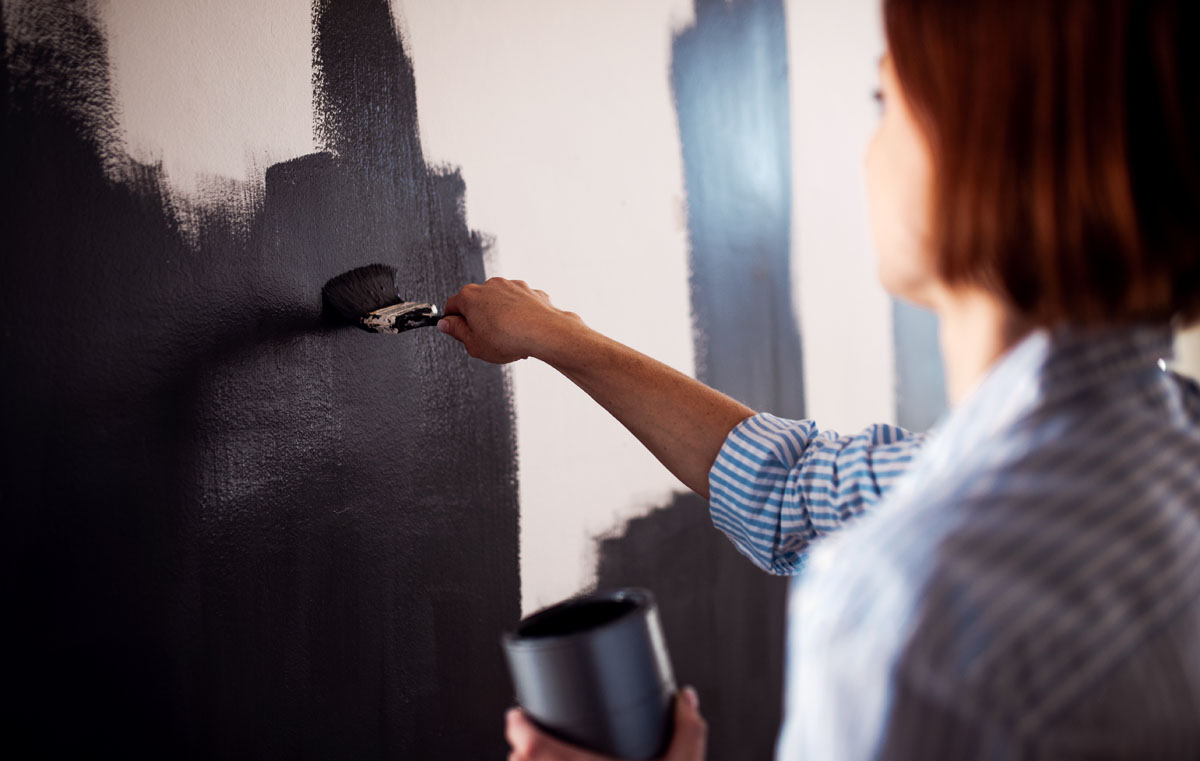
Walls
It is recommended to use bold and solid colours for the walls as using patterns may hint at the actual size of the wall. The exception to this is if you are creating a single feature wall to draw the eye. However, it is recommended to stay away from colours that are catalysts for insulation such as fiery reds, sun-kissed oranges, bright yellows and glossy blacks. These colours not only make the area appear smaller but also it tends to retain heat.
When going for a bright and cheerful ambiance, it is best to use citrus tones such as subtle lemon shades, a soft banana glow or pale creamy yellows. If you really love it and must use orange, go for a pastel hue or a sorbet orange shade. Minty greens, lime green and apple green colours also give off a vibrant and light atmosphere. These colours blend well with both artificial and natural lighting giving the space a bright and sunny atmosphere.
If what you are going for is a cool and airy vibe, sea shades should be your go-to colours. Lighter blues such as light cyan blue, rich turquoise, soft teal, and sky blue are considered breathy colours. Richer green tones such as seafoam green, light moss green, deep emerald, forest green and glass-bottle greens tend to give out a cooler atmosphere. These colours are considered cool colours as they do not retain heat and are soothing for the eyes.
Using natural earth-tone colours emphasizes a cozy and authentic aura for your space. Brown tinted shades such as tan, beige, light honey, muted gold, soft coffee, deep brown, and light taupe colours appeal to nature thereby making guests or customers feel more relaxed and comfortable. These colours are often seen on coffee shops and indie shops as it establishes their homely appeal.
If you are inclined to a more modern and corporate image, your best bet are colours that fall under the neutral metallic shades. Gun-metal grey, pearly-grey/white hues, silver matte, dusted gold, satin chrome, soft bronze and soft rose gold colours are some of the tones that accentuate a chic and innovative vibe.
If you want to make a room appear wider, a good technique is to use contrasting horizontal stripes, and vertical stripes if you want it to appear taller. Using accent walls is also a good trick to make a room seem more spacious. Accent walls can be achieved if you painted one side of the room with a bold tone such as mauve, peach, lilac, lavender, pastel pink or any other bright pops of colour against three other walls with plain reflective colours such as whites, creams or beiges.
At the end of the day, with so many colours to choose from, there really isn’t just one way to design your commercial space. If you find yourself overwhelmed and unsure with how you want to design your commercial space (and parked it in the too-hard-basket), your best bet would be to consult a professional shopfitting service like the team here at Quickfit, we would be happy to help. Give us a call on 1300 95 94 93.